Luana Gallam
About
Itaú
Financial Services · 2024
In 2024, a major financial company rebranded and needed to modernize its mobile app. Among all user journeys, salary portability was chosen as a key flow to redesign — aiming to improve performance, reduce drop-offs, and strengthen customer trust.
Users abandoned the flow early due to confusing steps, wrong employer data, and lack of guidance. The process also felt outdated compared to the new brand direction.
Partnering with BRQ Digital Solutions, I worked closely with business and tech teams to align UX and product goals. Using analytics, we identified friction points and redesigned the entire flow applying accessibility principles, visual hierarchy, and Design System consistency.
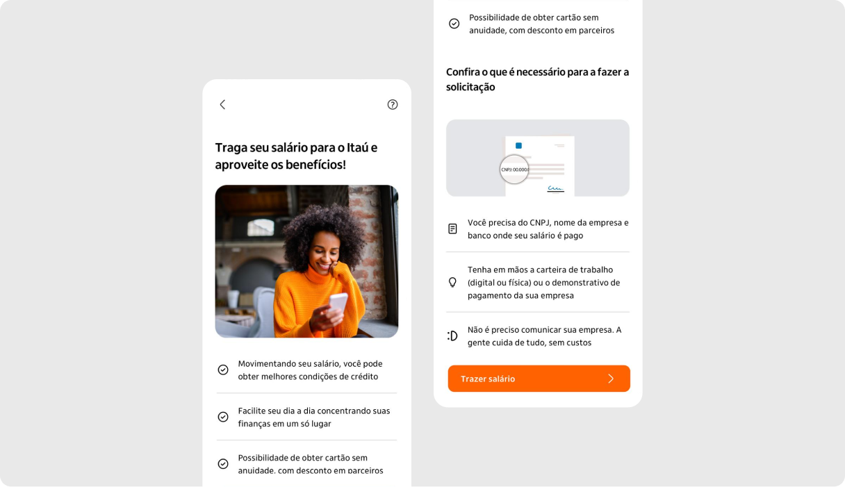
A key improvement was the context screen, designed to anticipate the information users would need to enter. This screen displayed visual examples and clear guidance, significantly reducing input errors and rejected requests.
During usability testing, this feature was highly praised — participants reported feeling more confident and less frustrated throughout the process.
The Solution:Streamlined the flow with clear structure and guidance.
Introduced helper content and tooltips to prevent errors.
Improved visual hierarchy, accessibility, and readability.
Added retention screens and personalized offers to reduce churn.

Results:+92.9% user satisfaction in usability testing.
Reduced rejection rates thanks to clearer instructions.
Improved conversion and retention, aligning business and UX goals.
Delivered a modern, trustworthy, and consistent experience matching the company’s new identity.
Credits:
Design Team.
Content Design Team.
Product & Business Team.
Engineering Team.
Other projects:
Back to home
Luana Gallam
About
Itaú
Financial Services · 2024
In 2024, a major financial company rebranded and needed to modernize its mobile app. Among all user journeys, salary portability was chosen as a key flow to redesign — aiming to improve performance, reduce drop-offs, and strengthen customer trust.

Users abandoned the flow early due to confusing steps, wrong employer data, and lack of guidance. The process also felt outdated compared to the new brand direction.
Partnering with BRQ Digital Solutions, I worked closely with business and tech teams to align UX and product goals. Using analytics, we identified friction points and redesigned the entire flow applying accessibility principles, visual hierarchy, and Design System consistency.

A key improvement was the context screen, designed to anticipate the information users would need to enter. This screen displayed visual examples and clear guidance, significantly reducing input errors and rejected requests.
During usability testing, this feature was highly praised — participants reported feeling more confident and less frustrated throughout the process.
The Solution:Streamlined the flow with clear structure and guidance.
Introduced helper content and tooltips to prevent errors.
Improved visual hierarchy, accessibility, and readability.
Added retention screens and personalized offers to reduce churn.

Results:+92.9% user satisfaction in usability testing.
Reduced rejection rates thanks to clearer instructions.
Improved conversion and retention, aligning business and UX goals.
Delivered a modern, trustworthy, and consistent experience matching the company’s new identity.
Credits:
Design Team.
Content Design Team.
Product & Business Team.
Engineering Team.
Other projects:
Back to home
Luana Gallam
About
Itaú
Financial Services · 2024
In 2024, a major financial company rebranded and needed to modernize its mobile app. Among all user journeys, salary portability was chosen as a key flow to redesign — aiming to improve performance, reduce drop-offs, and strengthen customer trust.

Users abandoned the flow early due to confusing steps, wrong employer data, and lack of guidance. The process also felt outdated compared to the new brand direction.
Partnering with BRQ Digital Solutions, I worked closely with business and tech teams to align UX and product goals. Using analytics, we identified friction points and redesigned the entire flow applying accessibility principles, visual hierarchy, and Design System consistency.

A key improvement was the context screen, designed to anticipate the information users would need to enter. This screen displayed visual examples and clear guidance, significantly reducing input errors and rejected requests.
During usability testing, this feature was highly praised — participants reported feeling more confident and less frustrated throughout the process.
The Solution:Streamlined the flow with clear structure and guidance.
Introduced helper content and tooltips to prevent errors.
Improved visual hierarchy, accessibility, and readability.
Added retention screens and personalized offers to reduce churn.

Results:+92.9% user satisfaction in usability testing.
Reduced rejection rates thanks to clearer instructions.
Improved conversion and retention, aligning business and UX goals.
Delivered a modern, trustworthy, and consistent experience matching the company’s new identity.
Credits:
Design Team.
Content Design Team.
Product & Business Team.
Engineering Team.
Other projects:
Back to home

